We have rebranded!
That’s right! We have rebranded a lot of our assets to better reflect who we are as a company.
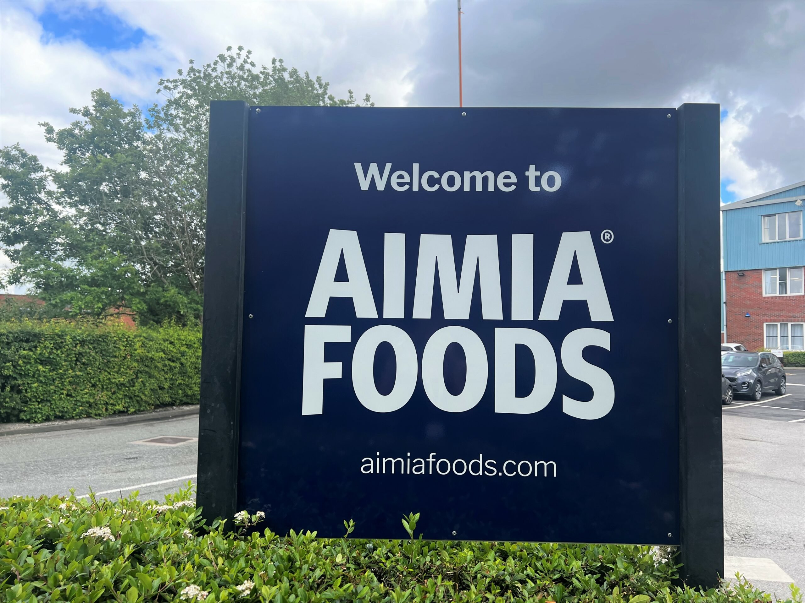
Here at Aimia Foods, our purpose is to enrich the lives of consumers by meeting their needs through the provision of quality brands and products. Our brands and people are at the heart of our business and we wanted to be able to showcase them alongside a newer, fresher look.
Recognising Aimia Foods as a ‘house of brands’, we wanted to refresh our identity to be fresher, clearer and distinct that allows us to talk about the brands that we are proud to work with, without sacrificing the equity in the Aimia Foods brand. This has all started with a logo that has been designed for maximum impact that sits well next to other logos.
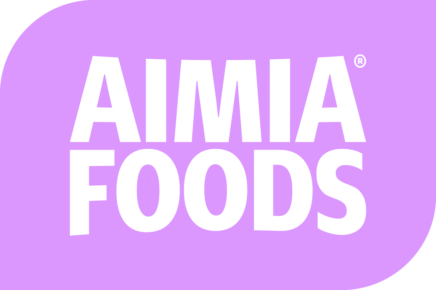
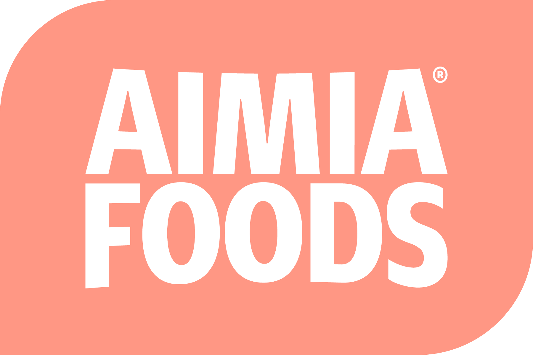
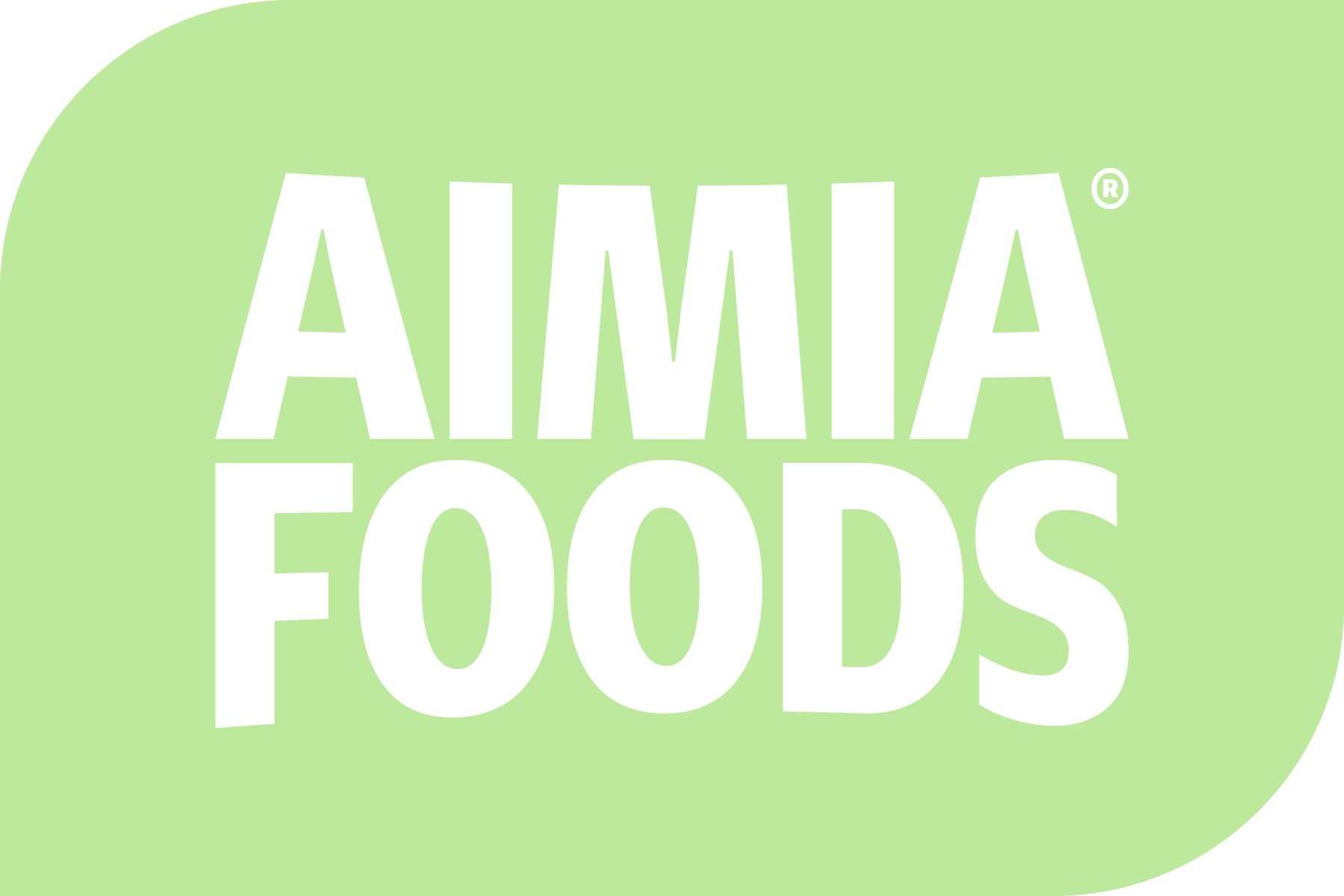
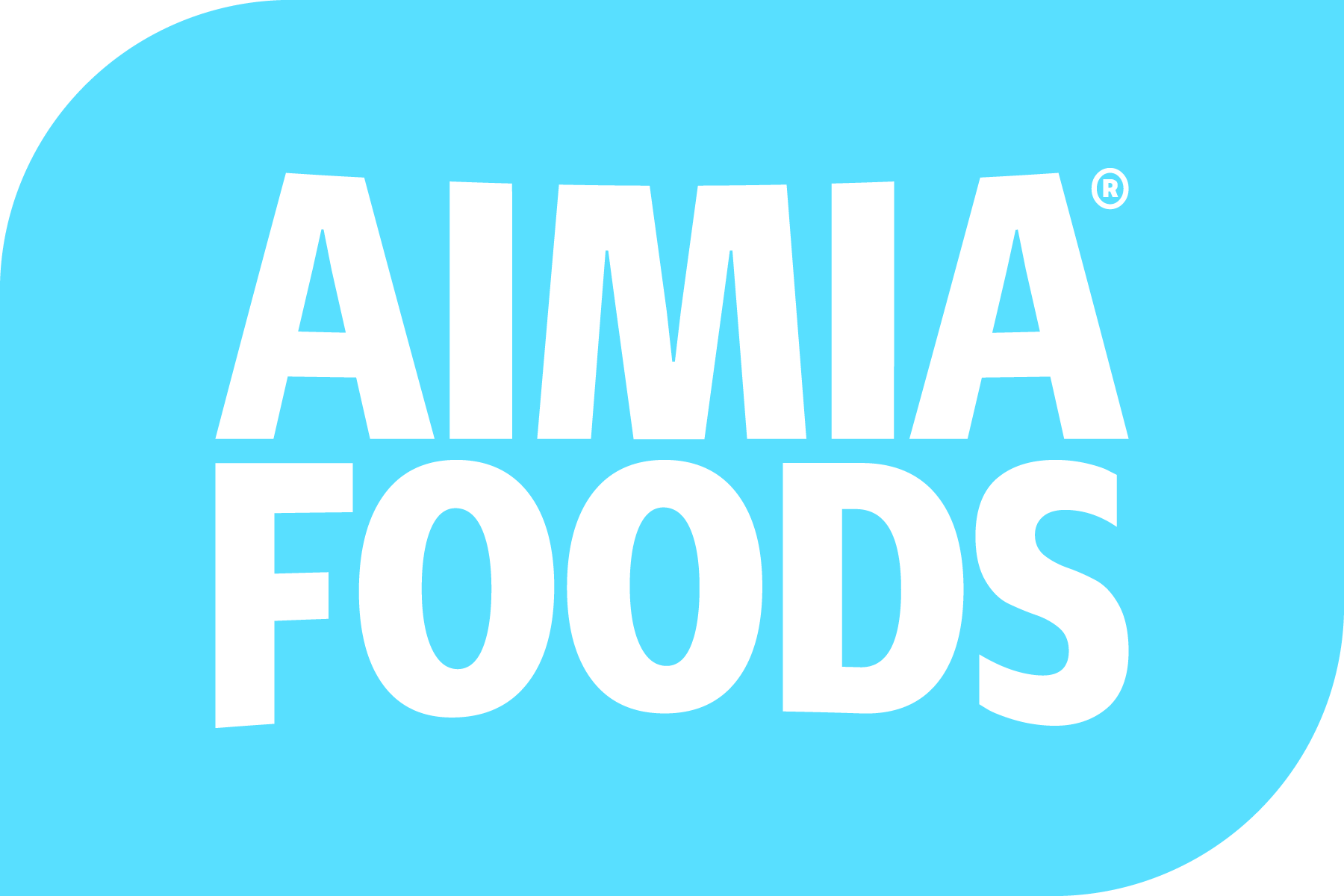
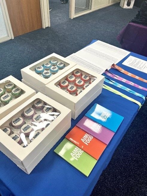
Let’s talk about our new brand colours. Vibrancy and energy are at the core of our business. It’s what we want from our people and our partners and this is now reflected in our colour palette. In an ever-increasing digital world, we no longer need to stick to a single colour rigidly (although we loved our classic navy colour so much – we decided to keep this as our main, corporate colour).
However, to accompany our lovely navy colour, we have introduced 4 new brand colours that really make us stand out in a crowd and that embody the companies direction.
We want our branding to reflect our vision, which is to; diversify through creativity, product innovation, new channels and partnerships, to meet the evolving needs of customers and consumers, to build trust and loyalty through developing our relationships, and to drive growth through expertise, passion and commitment of our employees.
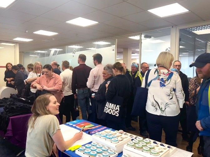
The internal rebrand launch at Aimia Foods Ltd head office
Here at Aimia Foods, we place our brands at the heart of our business, and we believe that through our newer, and more stylish look – we will be able to support our brands to thrive!